You might also like:
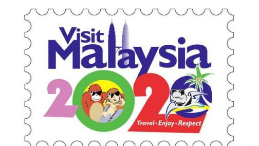
The new logo for Malaysia’s latest tourism campaign was supposed to entice international visitors and present a “colourful portrayal” of the country’s treasured flora and fauna – but it seems to be grabbing people’s attention for all the wrong reasons, with netizens slamming the Visit Malaysia 2020 design as “embarrassing” and “hideous.”
1998: we're gonna have flying cars in 2020.
2020:#VisitMalaysia2020 pic.twitter.com/yPxqlqmDYo
The dated sketch was launched on Saturday and shows a mismatched collection of Malaysia’s national animals hanging out, inexplicably wearing sunglasses, and drawn in very different styles. Netizens were quick to point out that the turtle, orangutan and proboscis monkey look like they were drawn on Microsoft Paint – by a child.
The official #VisitMalaysia2020 tourism logo literally looks like it was made in 10 minutes with microsoft paint. Honestly, of all things to skimp on. Malaysian graphic designers are crying everywhere. I can’t believe the world is going to see this??♀️ pic.twitter.com/DSmQksx2a2— Yoy (@ShrlSbrdn) January 28, 2018
Others called it a “disgrace to the nation” and a representation of “mediocrity.”
Really? This is the best the whole population of Malaysia can come up with? What an absolute disgrace to the nation. The tagline might as well have been: "Unappealing. Underwhelming. Unimpressive." #savemalaysia
Changed my mind about the Visit Malaysia 2020 logo. It’s a perfect representation of Mediocrity. Overcompensation. Insecurity. You know you could be better, so you throw everything + the kitchen sink into the logo to make up for it, but you also can’t be arsed to do a good job.
— Charis Loke (@charisloke) January 28, 2018
Embarrassed by the new offering, a number of people decided to create their own logo to showcase the graphic design talents of Malaysians.
collection of #visitMalaysia2020 posters done by netizen pic.twitter.com/Tde20OqE3z My personal #VisitMalaysia2020 logo because food is LIFE!
acah2 hebat letak watermark but it's okay. Fake it until you make it pic.twitter.com/B37Ym8hhTd
Despite the backlash, it doesn’t look like it’s going anywhere. Tourism and Culture Minister Nazri Aziz defended the logo, saying it would not be changed. He said the design was done by the same in-house team that had designed all of the Visit Malaysia logos since 1990.
“Criticism is normal, we cannot get the consensus of the whole of Malaysia,” Nazri told The Star.
“If we want to wait for everyone to agree, even by 2020 it (the logo) will not be completed.”
He said:
“I’d rather trust my staff than the netizens. Anyway, it was never meant for the locals, it was meant for tourists.”
Visit Malaysia 2020 is a campaign aimed drawing a total of 36 million tourists to the Southeast Asian country, to boost the economy and bring in RM168 billion (US$43 billion) in tourist receipts by 2020.
The campaign will be aligned with the World Tourism Organisation’s “Travel. Enjoy. Respect” movement launched last August, which encourages tourists to become a catalyst for positive change towards a better future.
The post ‘Disgrace to the nation’: Malaysia’s tourism campaign logo mocked online appeared first on Travel Wire Asia.
Source: travelwireasia.com